 If you have any questions about this page or if you find any errors,
please write a message to the
If you have any questions about this page or if you find any errors,
please write a message to the
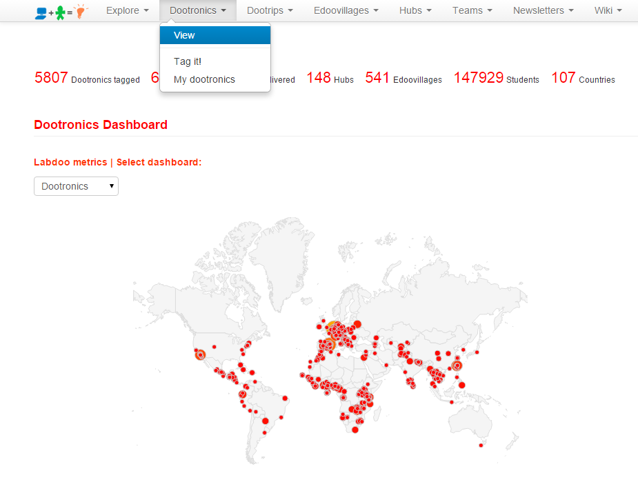
The design of the Labdoo social network puts special emphasis to providing transparency as one of the key mechanisms to facilitate the health of the system. To enable transparency, a series of dashboards are implemented allowing users to quickly know the status of the various objects (dootronics, dootrips, hubs, edoovillages, etc). These dashboards rely on a variety of mechanisms including geolocation maps, column charts, or dynamically configurable tables, to name a few. To access each dashboard, go to the Main Navigation Menu on the top of each page and click on one of the four Labdoo objects: 'Dootronics', 'Dootrips', 'Edoovillages' or 'Hubs'. Then click on 'View' to see the global dashboard for that type of object.
Figure. Example of visualization dashboard.
Optimized Cache to Speed Up Loading Time
The calculations that need to run in order to visualize each dashboard are quite computationally intensive due to the large amount of global data that they need to correlate. In order to speed up the loading of each dashboard and enhance the user experience, the Labdoo engine runs a caching algorithm, which works by computing the dashboards in the background once every hour (this frequency could change in the future but according to our experience this has worked quite well so far). That means that some of these dashboards may not display the latest information some times. Any changes made in the Labdoo system will be reflected in the dashboards at the next turn of the hour. For instance, if you tag a new laptop at time 12:35pm, the dashboards will show the new laptop starting at 1:00pm.